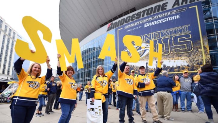
There’s not much going on in the NHL hockey world right now, but the Nashville Predators have a new alternate uniform that will get fans talking.
You’re never going to make everyone happy when coming out with a new jersey design. Everyone has different tastes and different creative imaginations. The Nashville Predators, and the rest of the NHL, have their “Reverse Retro” jersey for 2021.
Here’s a look at the Predators new jersey from Adidas, which is trying to mesh the retro style with some new flavor mixed in:
— NHL (@NHL) November 16, 2020
There’s been a handful of recent jersey designs for the Predators, with the 2020 Winter Classic jersey being the most recent. That tied into the history of hockey in Nashville with the Dixie Flyers.
Jersey analysis
Let me preface this by saying I’m not a fashion expert by any stretch of the imagination. Designing these uniforms is probably much more difficult than it looks and I would be horrible at this.
More from Predlines
- Nashville Predators 2023 Training Camp Spotlight: Kiefer Sherwood
- Captain Candidates if Nashville Predators Didn’t Have Roman Josi
- The All-Time 25 Games or Less Nashville Predators Lineup
- Nashville Predators 2023 Training Camp Spotlight: Cody Glass
- Joakim Kemell Flashes his Offense in Nashville Predators Loss to Tampa
With that said, I’m a little underwhelmed with what was brought to the table. If you look at all 31 teams’ designs, there are some that are absolutely on fire, and in a good way.
The Predators’ reverse retro jersey, while still sharp to look at, lacks much creativity for me. It’s not all that different from their most recent jersey designs. It really just blends the current home and road uniform into one.
To be fair, a lot of people originally didn’t like the Winter Classic jersey when it was first unveiled, but it’s grown on people since then.
The retro reverse does have some subtle designs to it that make it different from past jersey designs.
I like the silver Predators logo in the middle. There’s not a better and more intimidating primary logo in all of sports. Change my mind.
The triangular design pays homage to the 1998 inaugural team’s design. Here’s a look at the official description of the Predators design from the team’s website:
"“The speed nicks in the numbers, striping and crest borrow from the team’s first jersey, while the silver sleeve is a new addition.”"
There’s also a lot of clamoring about the need for more navy blue, which I have to agree with. For whatever reason, the team has never gone back to any type of dominant navy blue in their jersey since their all navy blue and silver alternate jersey from 2009 to 2011.
I think the way to go here would’ve been to include more navy blue and keep the gold on the shoulder sleeves. That would’ve been a much bolder jersey design that stood out more.
With that said, I’m sure these will fly off the shelf when they go on sale just in time for Christmas shopping. They’re not awful by any means.
If you’re into rankings, there’s already a good one out there from ESPN’s Greg Wyshynski ranking all 31 teams. If you get blocked by the paywall then I’ll save you the trouble and let you know the Predators come in at No.22, which is a fair assessment.
Other designs around the league
Some other teams who I think really did an outstanding job in terms of creativity and mixing old school with new school was the Colorado Avalanche, Winnipeg Jets, Arizona Coyotes and Minnesota Wild.
The Wild’s jersey might be my favorite. They blended their colors beautifully and it’s really going to pop on a television screen. The Coyotes went really bold by making purple the dominant color.
Much like their play on the ice, the Detroit Red Wings sadly take home the worst jersey design out of all 31 teams. You can’t even really call it a design, but more of just a last-minute effort to throw something together with a logo and all white.
I took away points from the Predators for creativity, but at least it looks like they put in an effort to make something sharp that stands out.
It looks like these will be worn in rivalry games for multiple times next season, so expect these to be seen when the Predators play the Chicago Blackhawks.
Not sure which other teams the league will consider “rivals” of the Predators, but maybe they’ll throw the Dallas Stars or St. Louis Blues in there as well.
Now I think we can all agree we don’t care which uniform they wear as long as they reverse this ugly trend they’ve been on for three years that has them heading towards the basement of the Central Division.
