

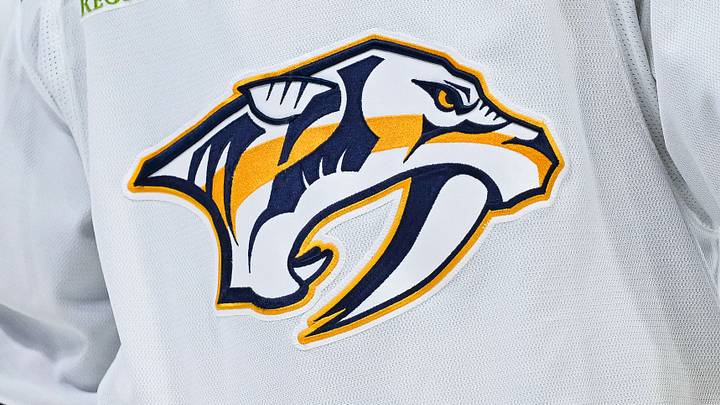
The Nashville Predators will finally be able to wear a third jersey this season.
The NHL and Fanatics, the League's official supplier of jerseys, announced Wednesday that teams will see the return of a league-wide special edition uniform titled Hometown Remix. It is the first of its kind since the adidas' reverse retro series in the 2022-23 season, where the Predators wore the iconic mustard cat sweater.
Nashville has without a doubt one of the distinct hockey environments in the League. The city has transformed the definition of what a hockey town is. From throwing catfish on the ice every game, to playing country music during intermission, Bridgestone Arena is one of the most ecstatic buildings in all of hockey.
For that reason, these new jerseys should best represent that southern culture the Predators have made their own. Here are the things Fanatics should consider when constructing the team's next sweater.
This could finally be the year we see the Predators wear navy
It has been long overdue, but the Predators desperately need the return of a navy sweater. For years, many fans and analysts found the yellow on their home jerseys too excessive and hard to look at. I may be a bit biased, but I like the yellow, however I do agree that there needs to be bit of other colors to add some contrast.
Navy blue is the Predators second color, yet there is a limited amount on both their home and away jerseys. If there is one thing Fanatics needs to get right, it's to bring back the navy.
A catfish has to appear somewhere
A catfish is a must. I mean, where else do you see fans throwing them out on the ice every game. The tradition is so unique, and primarily what made Bridgestone Arena one of the most sought-after hockey fan destinations. Whether they incorporate it by making putting it on a shoulder patch or actually putting a catfish graphic on the sleeves or the front, a catfish would be a nice touch to what makes Smashville unique.
The Batman Building is an iconic figure in Nashville's skyline
One of the most iconic buildings in downtown Nashville is 333 Commerce Street, better known as the Batman Building by locals. The crest of the building strikingly resembles Batman's mask with his pointy ears. An idea that I believe would be a smart way to incorporate it is using the word 'Nashville' and either turn the 'N' or 'H' into the building. The pointy segments of the letters can resemble the building's roof and antennas.
Reusing the guitar strings is key

The Predators already did a good job at doing this so Fanatics should really consider bringing them back for these jerseys. The six stripes on the jersey's numbers is something fans may brush over as just an aesthetic design. Those stripes represent none other than guitar strings, which is a staple in Nashville, especially along Broadway where evening walks become walk-through concerts in the streets. It would be cool if they reused the strings not only on the numbers, but also along the bottom of the jersey, potentially in gold.
These are just some of the things Fanatics should think about when designing the Predators third jersey. Smashville is a vibrant hockey atmosphere, and these new sweaters need to represent that one way or another.
 Add us as a preferred source on Google